

 07.03.2026
 295 görüntülenme
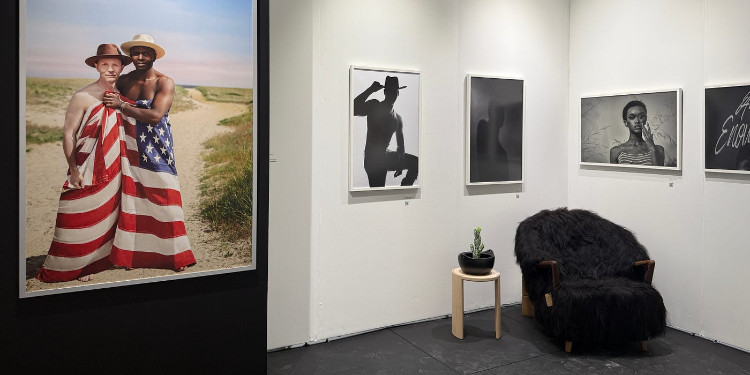
With less than two months left until Miami Art Week 2025, let’s take a look back at last year’s events. When the doors opened for Scope 2024 VIP Preview, the stage was already being set for music. As you can see in the video, Yinka Ilori Mbe’s piece Lift Me Up With Joy, which covered the entrance area and was sponsored by Sapphire Reserve, immediately stood out. Unlike many other fairs that took place during the same week, it was a well–orchestrated VIP preview; neither overwhelming nor underwhelming. A spacious layout, professional setup, and carefully placed galleries.
As an artist, I find it rewarding to see video art represented at fairs. Increasing diversity across mediums and disciplines is a wonderful step toward ending the misconception that artworks are limited to things hung on walls or small sculptures sitting on pedestals. Of course, when commercial galleries attempt this, they must either be confident that their non–video works will still sell, or not care much about it.
With its Open Editions booth, Scope opened up for sale works and memorabilia produced in unlimited quantities, whose continuation was uncertain, not the only fair to do so. Still, it gave me an odd feeling to see editions of metal sculptures I had encountered at a museum in Washington, D.C., hanging in the booth alongside T–shirts and magnets for sale beneath them.
The WhiteWalls x CoinDesk collaboration seemed to position itself as the first to merge the idea of turning screens into artworks with crypto assets, yet the practice of tech companies sponsoring dazzling designs or videos and effectively turning them into wallpapers is all too common. The fact that even well–known Turkish artists have fallen into this trap may have advanced their careers but has ultimately weakened the substance of their work.
I’ve always appreciated booths that alter their flooring [with sand, stone, or paint] and I’m grateful to galleries that move away from clichés in doing so. That was the case with Fuze. Heino Schmid’s works in wood, clay, charcoal, and paper harmonized successfully with the space [29:10]. Experiences like this are better categorized not as ‘a few works displayed together’, but as site–specific installations, transformations of space. In this instance, however, the transformation had begun but wasn’t fully realized due to a lack of contextual information. Once again, the importance of wall labels comes into play; the information provided was limited to artist name, year, medium, and size. In fair presentations, the institutions’ sales focus often erases the narrative. In this specific case, without that narrative, the viewer’s experience remained incomplete. Another problem soon follows for the gallery and artist: overestimation. This tendency leads people from different educational and socio–cultural backgrounds to interpret artworks in fortune–teller–like ways, the work fails to anchor its own story.
Artists, unless you’re about to become a new Hokusai or bring an entirely new perspective, technique, or experimental approach, please stop painting landscapes, waves, and seas. I know that many so–called masters dominated the field for years with paintings of horses, fish, and dogs, but if your line is traditionally figurative, stay away from these subjects.
The ARTXCODE booth showcased drawings created and exhibited through stylus–integrated digital devices. I hope it made viewers reflect deeply on where the concept of ‘artist’ begins and ends. Again, we see the need for context and explanation. Printed materials run out fast in fairs, leaving some visitors informed and others not. In large booths [usually staffed by one or two people per gallery], attendants can’t always interrupt conversations to inform curious visitors, leaving gaps in understanding. Leaving the space without QR codes or texts [whether to maintain minimalism or due to oversight] results in such voids. Still, we can say that QR code usage across the fair was generally successful.
Sponsored by Amnesty International USA, Cassandra Mayela Allen’s piece Threads of Humanity was crafted from fabrics donated by displaced Venezuelan migrants, bringing attention to hundreds of life stories. When I spoke with them and mentioned that ideas in my own works are considered criminal in over thirty countries, they were shocked. In nations where laws are bent or arbitrarily applied, criticism of oppressive religious practices can be labeled ‘insulting religious values’, and politically charged works exposing authoritarian regimes can be prosecuted as ‘insulting parliament or state powers’. Consequently, we witness the shameful imprisonment [and in some countries, the killing] of artists, musicians, cartoonists, and broadcasters.
The Tea Room Art Collective’s performative installation Life Force in Every Moment, inspired by Japanese tea culture, drew significant attention. The work, which required pre–registration with the host gallery before sitting, was priced at 200,000.
I must note, dear galleries, please don’t surrender your booth to too many works by the same artist, especially if their visual language is uniform. It ends up looking as if you’re selling the same lighter in different colors. If you absolutely must, keep editions or variations in the stockroom and allocate the remaining space to other artists’ diverse works.
There are certain equations that almost always yield positive results. Spiritual content + vibrant colors + mystical objects is one of them. Skulls, for instance, consistently attract attention and are considered ‘guaranteed sellers’ in the art world; especially when sculpted and merged with spiritual motifs, as Marcos Alvarado did.
I came across an excellent example of text–based art at the David Lusk Gallery: John Salvest’s Omnia Vanitas series [39:58]. Using different alphabets, he aligned the black and white areas of shredded paper to spell ‘all in vain’, presenting them framed on paper once again. Such works caught my attention not only because they have real sales potential [fulfilling a fair’s commercial goals] but also because they don’t treat people like fish reacting only to bright, shiny things. I enjoyed them thoroughly.
Among the memorable works for me were those of Pavel Dušek, exhibited by The Chemistry Gallery from Prague. His experimental and at times brutalist color treatments stood out. Covering a section of the background with purple fabric may have seemed like a small touch, but it made a major difference in presentation. In such booths, for the average viewer [unfamiliar with the artist’s story] a presentation advantage can make a work stand out, and for collectors, it can even be a deciding factor. Therefore, unless the background or flooring is a curatorial element [that is, unless removing it changes the context] it’s important to imagine artworks in different spaces while viewing them.
The Lucy Sparrow booth from the UK, featuring a recreated grocery store made entirely of fiber [49:00], was quite eye–catching. Transforming mushrooms, pears, bananas, carrots, onions, and dozens of fruits and vegetables into fabric sculptures, she reached this level of interest by using another successful formula: repetition + color + scale. However, in her booth, which also included two–dimensional, framed versions; the emphasis on sales and decoration naturally overshadowed the original conceptual intent of the series.
On the other hand, it was enriching to see the full artistic practices of artists I had previously encountered only in limited form within museum contexts.
Outside, sculptures built to withstand weather conditions were placed with reasonable spacing on the sand. Still, while touring the interior [especially for visitors attending mainly for the social atmosphere] there was little reason to step outside. Since individual and group visitors behave differently while touring, unconventional directional guides are often needed. IKEA–style floor markers and arrows could have ensured a much smoother flow through the space. Their frequent use in art fairs would make a significant difference in both statistical outcomes and experiential quality.
Yorumlar (0)
Bu gönderi için henüz bir yorum yapılmamış.
Yorum Bırakın