

 01.03.2026
 341 görüntülenme
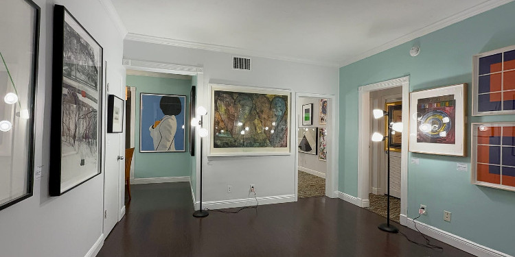
Let’s take a look back at the 18th edition of INK Miami, whose 19th edition will take place on December 3–7. As an event focused exclusively on works on paper, the fair stands out among Miami Art Week events as a domain-specific gathering. Its dedication to printmaking, drawing, and other paper-based practices makes it a special meeting point for collectors, curators, and viewers interested in graphic arts. December 4–8, 2024, Miami Beach, Suites of Dorchester Hotel. We are welcomed by a spacious atmosphere in the authentic hotel/motel (open–air) courtyard, a very common architectural typology in the U.S. The hotel’s suite rooms are assigned to galleries; the lighting setup and the hotel’s transformation are, overall, successfully adapted for the fair. The event is free with registration. Fifteen galleries and presses participated as exhibitors: Childs Gallery, Flying Horse Editions / UCF, Graphicstudio / USF, Gregg Shienbaum Fine Art, Haystack, Island Press, Jim Kempner Fine Art, Kress Contemporary, Manneken Press, Mixografia, Pia Gallo LLC, Tandem Press, Stoney Road Press, The TAG Fine Arts (UK), and The Tolman Collection (Tokyo).
The uniqueness of the venue creates quite an enjoyable ambiance. For a viewer who avoids crowds and knows what they’re looking for, it’s perfect. Naturally, the hotel choice comes with complications that might feel odd to Art Basel fans: prints displayed on sofas, inadequate lighting in some suites that needed extra lamps incompatible with the space, additional tables adapted to the rooms, and so on. Thinking of mainstream fair habits, I want this image to form clearly in your mind; to remind you not to be overly fixated on the placement and presentation of important works.
Compared to other art week fairs, the artwork labels here are far more detailed and professionally prepared. You feel like you’re on vacation and simultaneously watching or discovering something you enjoy. The sense of ease isn’t just spatial; it’s behavioral. The cold attitude of gallerists common at other fairs is absent here. That familiar feeling of “If you’re not here to buy, you don’t belong” never arises at INK Miami. There are fewer staff members/gallerists than one would expect in each suite. When compared with booth culture, there are fewer representatives even though the space is larger. Brochures and informational texts are more accessible. You don’t feel like a pair of eyes is constantly tracking you.
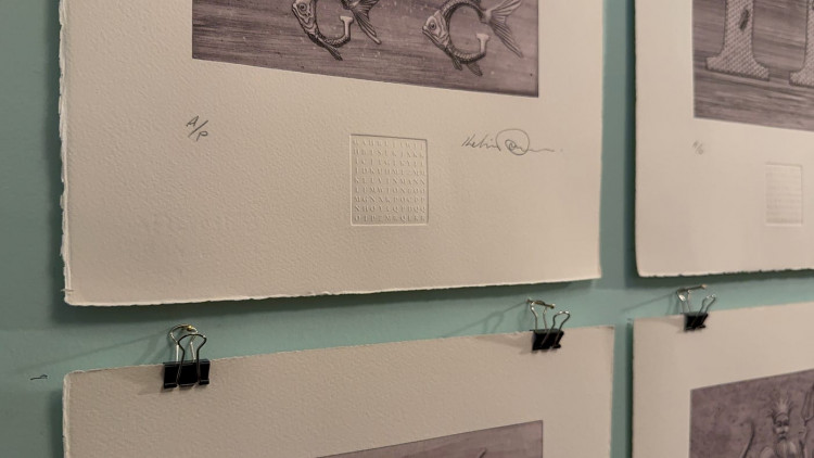
Because the fair consists mostly of printmaking, you find yourself watching the techniques compete as much as the artworks. Ed Ruscha, John Baldessari, and Hokusai works are, as always, astonishing.
In the Graphicstudio suite [affiliated with the University of South Florida] Mark Dion’s series Word in a Box [8:21] caught my attention. A suite of 27 prints (lithography, cyanotype, digital, screenprint, etching, letterpress, and woodcut) presented in a custom oak box; the lid features an image produced through etching and letterpress, while the inside of the lid holds a lithographic inventory list. He uses words in such harmony with the images that he succeeds in drawing the viewer into historical, geographical, and other scientific topics they might normally ignore, using visuals that are not overwhelming.
Stoney Road Press suite, I’m easily distracted, there are many works beckoning me. Then I see Dorothy Cross’s gloves [15:01]. The fact that I cannot find a text about their story online is frustrating. All we know is that they are leather gloves with 9–carat gold fingerprints on the fingertips, dimensions and price. Perhaps because my practice is installation–oriented, I later notice her Medusae and Ghost Ship prints. Displayed with a large text beside them [14:43], Darkness & Light [completed in 2017] is said to continue her explorations with luminescent materials. The trees in the work are companions like day and night, reflections of each other; containing both positive and negative, both dark and light conditions. When overlaid, they completely cancel one another out in a relationship of total opposition.
I remember Alex Israel’s Desperado from the 2023 IFPDA fair in New York [19:28]. Mixografia is a very active gallery. Analia Saban’s monoprint on handmade paper, Designed in France, Made in China, Clothing Tag [19:45] catches my eye. Because I’m drawn to conceptual works, I immediately approach it. One edition of this piece [completed in 2019] is in LACMA (Los Angeles County Museum of Art) collection. I’ve seen the artist’s bag–like prints in another museum as well, a unique visual language. Saban is an artist who explores the relationship between material, process, and transformation in contemporary art, aiming to push forms and functions beyond the familiar through her use of diverse materials. She foregrounds the transformation and texture of materials; with a minimalist and conceptual visual language, she invites viewers to relate materially and spatially on both visual and intellectual levels. Regarding her identity and practice, she can be described as an experimental and analytical artist whose works interrogate individual and collective perceptions through material and process, presenting a multidimensional and multidisciplinary approach.
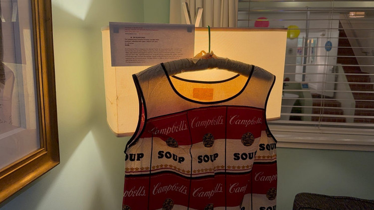
At Pia Gallo LLC, the 1966/67 Campbell Soup Company Souper Dress [22:01], made of cellulose/cotton paper, of course recalls Andy Warhol; and it would not be wrong to say it was produced in his honor. His Soup Can works from 1961 and after likely come to mind. Viewers outside the U.S. may not realize how often this soup appears in daily life, they may think it’s a fictional product [I know a few people thoughts that for real]. To summarize: sometimes supermarket soup aisles look like an art fair unto themselves. Although Warhol’s practice is far deeper, he suffered what many popular artists experience: an artwork series becomes fused with their identity, sticking to them inescapably. The label at the fair explained that Pop Art is not a movement defined by a manifesto but a cultural sensibility and aesthetic that emerged in the 1950s and expanded in the 1960s; that artists like Warhol blurred boundaries between art and everyday life through works referencing advertising icons, cartoons, and billboards; that the fashion world embraced the spirit of Pop Art, accelerating its spread; and that disposable paper dresses produced particularly in 1966–67 exemplified the merging of art and commercial consumer culture.
Among my favorite fairs, INK Miami is one where I would have liked to find more texts explaining the background of certain works. No matter how much I searched, I could not access information beyond price and dimensions for many of them. As another edition [imbued with the comfort of a home atmosphere] comes to an end, the lithographs I saw in The Tolman Collection Tokyo suite [22:51] stayed with me for a long time.
Yorumlar (0)
Bu gönderi için henüz bir yorum yapılmamış.
Yorum Bırakın